Facebook advertising is one of the most effective ways to reach new customers and grow your business.
It allows you to create highly targeted advertising campaigns and reach the right audience, making it a must-have tool for various kinds of businesses.
The problem is that designing a great Facebook ad can be a challenge, especially if you don’t have an eye for design by nature.
On the one hand, you have to consider Facebook's image guidelines and the ad's dimensions and layout, while on the other hand, you have to create an eye-catching design that will grab people's attention and convince them to click through.
In addition, the nature of Facebook ads costs means that the better design you have, the more clicks you get, which lowers your cost per action.
To help you with this, in this post, I will share with you some of the best Facebook ad design tips and some examples of stunning ads that will hopefully inspire you. This will allow you to know exactly what to do when designing your next Facebook ad campaign.
Why Is Great Visual Design Important?
Whether you want to make money with Facebook ads or simply increase the reach and engagement of your page, a well-designed ad is essential.
A good design will help you capture people's attention and convey your message more effectively, which can make all the difference when it comes to getting people to take action.
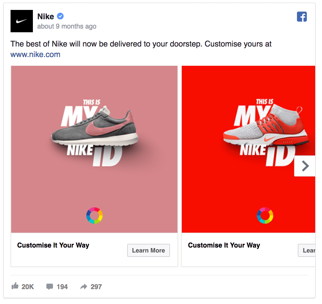
Image Credit: https://karolakarlson.com/
People are also attracted to a visual design that looks professional and trustworthy, which is essential if you're selling a product or service. A good design will make your ad more visually appealing, thus increasing the chances that people will notice it and engage with it.
Even if you are only trying to build brand awareness, a visual element will make it more likely that people will remember your ad.
Moreover, when you consider that people can share the stuff they find the most interesting with their friends, it's easy to see how a great design can help you reach a wider audience somewhat organically.
The Importance Of 20%
In the past, Facebook required that the amount of text in your ad image was less than 20% for it to be approved.
The 20% text rule was put in place to ensure that people would see more images and less text when scrolling through their News Feeds. It was also meant to improve the quality of ads on Facebook since many businesses were using images with too much text, which made them look spammy.
However, based on advertisers’ reaction to the user experience, they decided to do away with this rule. This means that technically you don't have to worry about the amount of text in your image as long as it's relevant to your ad.
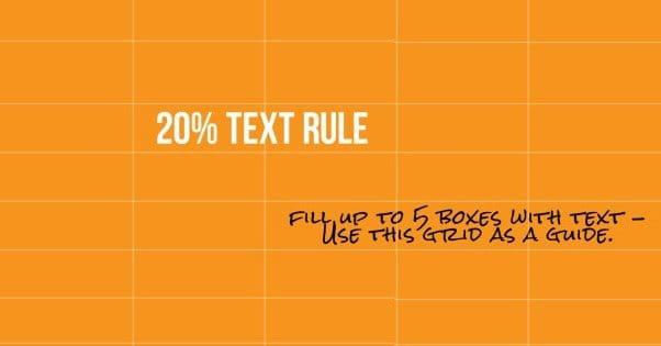
Image Credit: https://boostlikes.com/
That said, even though the 20% rule is no longer enforced, it's still a good idea to use images with little or no text for your ads. This is because Facebook can still disapprove of images with a lot of text, and they are less likely to stand out and get the attention you want them to.
So, when designing your next Facebook ad, make sure that you consider the images you use and avoid overusing text to increase engagement.
Here are a few more ideas to consider regarding the ratio of text to image in your ad.
The Various Placements Available
Another factor to consider when designing your Facebook ad is the type of placement you will use. Facebook offers a ton of different options when it comes to this placement.
Some of these include:
While the specification that Facebook places are similar for various placements, there are always subtle differences that you must consider if you aim to reach the maximum number of people possible.
Consider The Various Types Of Ads
The Facebook ad formats you use will also play a significant role in the overall design of your ad. Depending on what you're trying to achieve, different ads will be more effective.
The following are the official Facebook ad campaign design rules for the various types of ads.
Image Ads
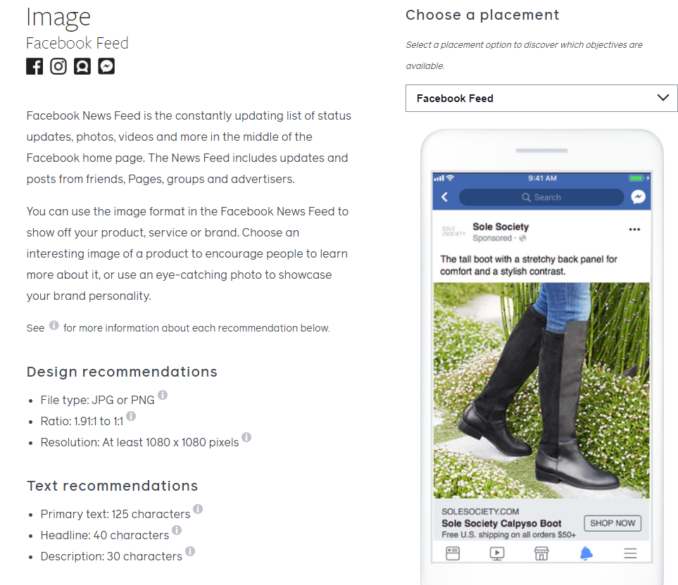
Facebook Image Ads
These are thumbnailed images with your chosen copy and a link to your website. Typically the most commonly used ad type, image ads can be very effective when done well.
Check out the full design recommendations provided by Facebook.Video Ads
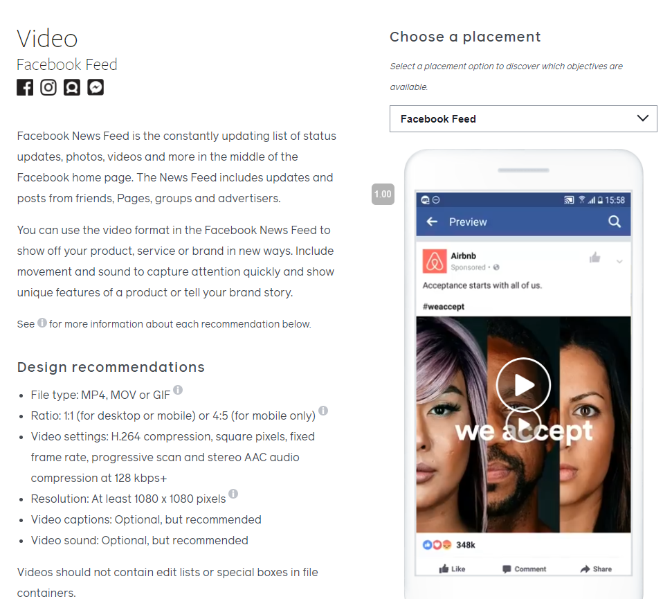
Facebook Video Ads
With this format, you can feature a video along with your copy and a link to your website. This is great for visual learners or if you want to show off a new product in action as it gives you more flexibility to show off what you're offering.
Here are the official design recommendations for video ads.Carousel
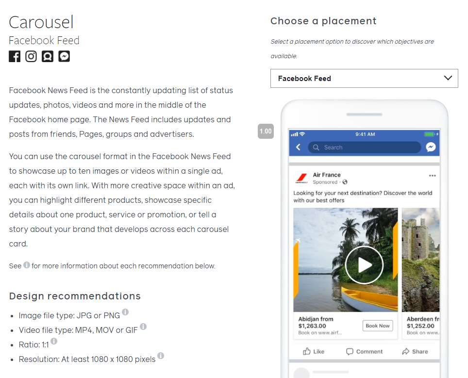
Image Credit: https://litcommerce.com/
Your ad images in carousel ads have more creativity than ever before. With up to 10 photos, you can tell a rich story that engages people on all fronts. You can also highlight various products or services, show a process, or even demonstrate a before and after process.
Check out the full recommendations for carousel ads.Collection
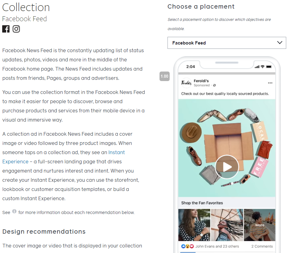
A collection consists of a video or image that serves as the cover and then an additional three images.
This can be a full-screen page that increases your engagement and interest in whatever you are advertising. People can then see an instant experience when they click on such a collection. You can use various templates with this type of ad, and knowing what’s possible will allow you to make the best possible choices.
Facebook feed ads
Here’s all you need to know about carousel ads.
Facebook Ads Design Tips
If you want to get the most Facebook ads benefits, there are various design tips that you can use to make your ads more effective and engaging.
The following Facebook ad design tips will help you create winning ads that get results.
Use Split Testing To Find The Right Facebook Ad Design
Getting a winner right out of the gate isn't always easy, so using split testing can be great to find the best possible design for your Facebook ads.
With Facebook offering various tools that make split testing easy and effective, there's no reason not to try out different ad designs and see which gets the best results.
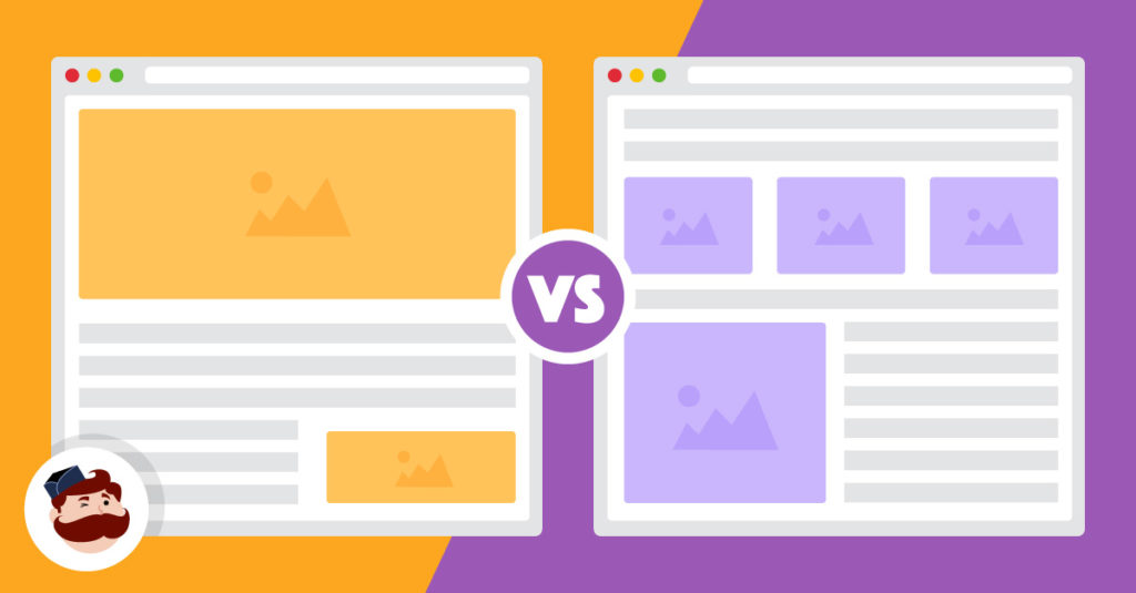
Image Credit: https://adespresso.com/
The same concept applies to the various sections of an ad, so testing out different headline, text, image, and call to action combinations can also help you find what works best for your target audience.
Simple, Clear Representation Of The Marketing Message
To create an effective Facebook ad design that resonates with your target audience, it's essential to use a simple representation of your marketing message. This means using solid images or videos that convey the key benefits or features of your product or service in a straightforward way.
To maximize the impact of your Facebook ads, be sure to keep things simple, avoid clutter or distractions in your visuals and copywriting, and utilize high-quality images or video content whenever possible. Additionally, focusing on creating a persuasive value proposition and clear calls to action can help you connect with your target audience and encourage them to take action.
Get Your Image Sizes Right
To create a stunning, effective Facebook ad design that will get results, it's essential to ensure that all of the various image elements are sized correctly.
This may involve adjusting the dimensions of your images or optimizing their file size to maximize clarity and minimize loading time. Additionally, using preset templates or guides when creating your ads will help ensure that everything is appropriately aligned and looks professional.
Following Facebook's size guide can help you avoid any potential issues and create ads that look great and perform well.
Ad Placement Should Inform The Design
When creating a Facebook ad design, it's essential to consider where Facebook will place your ad. This is because your ad's size, shape, and format may need to be adjusted depending on where it will appear.
Knowing where Facebook will place your ad can help you select the most effective design and layout for your ad and ensure that it looks great no matter where it appears.
Making Powerful Images Is Not Hard
There are tons of tools that you can use to make impressive visuals for your ads, even if you're not a professional designer.
Canva is an excellent option for creating simple designs, while more advanced users can utilize Photoshop or Illustrator. Additionally, various online tutorials and resources can teach you how to create stunning visuals, even if you've never used design software before.
Utilizing high-quality images in your Facebook ad design can help you capture attention, convey your message clearly, and encourage people to take action.
Choose Complementary/Contrasting Colors That Stand Out
Using a color flywheel is a great way to select complementary colors that work well together and make your ad design pop. You can also use contrasting colors to help some aspects of your ad stand out, such as the call-to-action button.
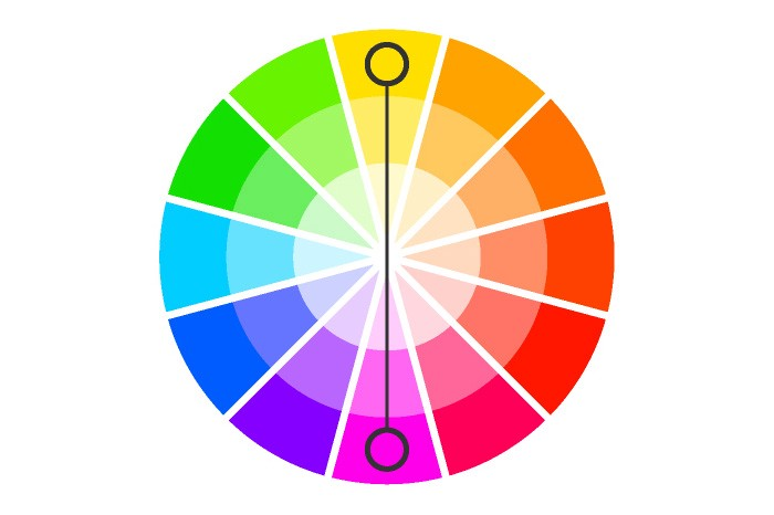
Image Credit: https://uxplanet.org/
Some common color patterns to try when designing your Facebook ad include complementary, analogous, and triadic. Choosing a mix of warm and cool colors can also help create visual interest.
Keep in mind that these colors should align with those used on your website and other marketing materials to create a cohesive brand identity.
Design For Mobile
It's essential to keep in mind that people will be viewing your ad on both desktop and mobile devices (with the latter always increasing). This means that you should optimize your ad design for both platforms.
Mobile users are often scrolling quickly through their News Feeds, so you'll want to make sure that your ad stands out and is easy to read. Utilizing bright colors, large fonts, and clear images can help. You'll also want to avoid using small text or images that might be difficult to see on a mobile screen.
Keep The Landing Page Consistent With Your Ad
Similar to using consistent colors on your ad and landing page, it's essential to ensure that there are no significant design differences between your ad and the page it links to. This will help keep people engaged, as they'll have a consistent experience across both platforms.
In addition, the messaging used when designing your Facebook ad should also be consistent with that used on your landing page. This means using the same language, tone, and voice throughout both pieces.
Your ad creative can be as simple or complex as you want, but it must be aligned with your brand's overall look and feel.
Use The Right Relevant, High-Quality Images
When selecting images to use in your ad design, it's important to choose relevant, high-quality, attention-grabbing and visually appealing visuals. These images should be well-composed and convey the message of your ad clearly. Additionally, make sure that any people featured in your images are facing towards the center of the frame to look directly at the viewer.
Use Location-Specific Imagery
If you're advertising a local business or service, using imagery that shows an actual location can be a great way to help your ad stand out in people's News Feeds. This will also increase the chances of your ad being clicked on since it will seem more relevant and trustworthy to mobile users who are physically nearby.
Make Your Value Proposition And Call To Action Clear
Having a great ad design counts for nothing if your value proposition and call to action are not clear. Ensure that your ad copy is concise and to the point so that people know exactly what you're offering and why they should care.

Image Credit: https://blog.storeya.com/
If you can't explain what you're offering in a few short sentences, you may need to rethink your ad messaging and design.
In addition, be sure to include an actionable call to action in your ad text, such as "sign up today" or "click to learn more." Including this type of wording will help encourage people to take the desired next step after seeing your ad.
Examples Of Excellent Facebook Ad Designs
Using the Facebook ads library, we can see many excellent facebook ad designs. Some of my favorite examples include ads from brands like Nike, Hootsuite, and D&F clothing, which use bright colors and eye-catching images to engage viewers quickly.
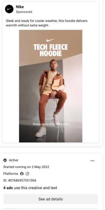
Nike Facebook ad template example
There's only a limited amount of text in this image ad, which in this case is enough to convey the brand and message. This ads is also well-designed, using clean fonts and layouts that are easy to read on both desktop and mobile devices.
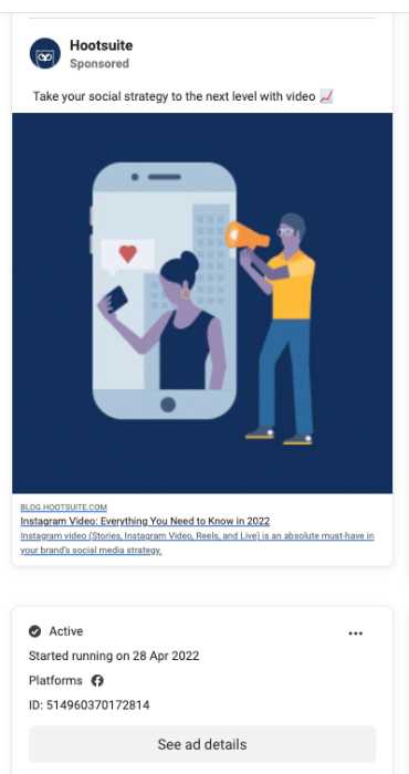
Hootsuite Facebook ad template example
With no text being used on the ad itself, the imagery needs to explain what is being promised in the ad. In my opinion, Hootsuite does this fairly well with a simple, uncluttered image that conveys the meaning to the viewers.
That said, some text on the image might have made this even better.
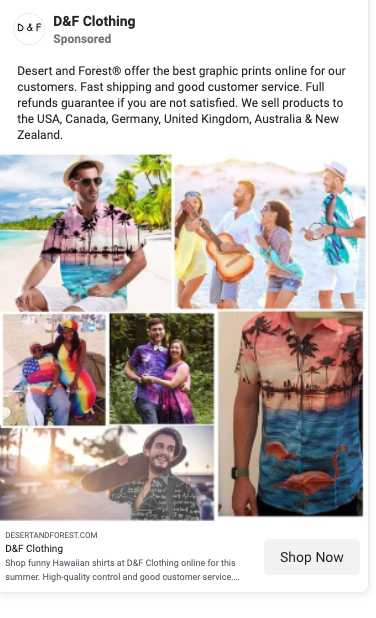
D&F clothing facebook ad template
Another example is the ad for the clothing brand D&F, which uses impactful yet straightforward imagery to draw attention to its products immediately.
A bit lengthier on the ad copy, this company explains what they're all about and where they ship their products. This allows their target audience to know more about what they can offer.
They also use a collection of bright colors to get the message across.
These ads are well-designed and highly effective at getting people interested in what they have to offer.
When making your own Facebook advertisements, take some time to consider how you want them to look and feel so that they form a coherent marketing message across all platforms.
Getting The Best Possible Design Created
The best way to get an excellent design for your Facebook ad is to hire a professional designer. This will ensure that your ad looks terrific and catches people's attention.
There are many different ways to find designers, such as online directories, social media, and freelancer websites. Once you've found a few designers you like, reach out to them and discuss your project in detail.
Be sure to provide them with all the necessary information about your business, such as your brand guidelines, target audience, and what you're hoping to achieve with your ad campaign. The more information they have, the better they'll be able to create a design that meets your needs.
When working with a designer, give them feedback and provide as much direction as possible. This will help ensure that you get the best results from your ad campaign.
Apart from this, consider using real pictures of your products or services. Rather than using stock photos, these will make your ad more relatable and trustworthy to potential customers.
Make sure you use natural sunlight if possible when taking these pictures for the best results.
If you must use stock photos, then some websites that I recommend are Unsplash and Pexels, which offer high-quality images that you can use for free.
There are also paid stock photo options, which offer a broader selection of images and more customization options.
Finally, it's also a good idea to check out what your competitors are doing regarding their Facebook ad designs. See what's working well for them and try to incorporate some of those same elements into your ads.
Conclusion
Using Facebook ads as part of your social media marketing strategy will ensure that your business stands out from the crowd and connects with potential customers in a meaningful way.
To get the best results, focus on creating an eye-catching design that conveys your message and call to action.
Doing the work to find what your target audience most needs help with and crafting your ad copy around that message will be sure to capture their attention.
In addition, actively testing different variations of your ads using Facebook's A/B testing tools can help you find which combinations work best for your business.
With all of these tips in mind, it’s now time to create your first ads in Facebook while keeping the above design tips in mind. With this, you're sure to see an increase in leads and conversions from your Facebook ad campaigns.

