Email marketing is a powerful tool for businesses to market their products and services, but one must put some time and effort into designing campaigns correctly if the aim is to make the most out of the emails sent.
A well-designed email marketing campaign has the potential to bring in new customers, increase loyalty with existing ones and boost your bottom line. On the other hand, the wrong campaign can dramatically reduce open rates and, even worse, increase unsubscribe rates.
In this article, we'll cover everything you need to know about designing an email marketing campaign and include examples of the items that define the right email marketing design. Let’s get right into it
The Basics That Make Email Design Great
Imagine that you get an email from a brand that you love. As soon as you excitedly open the email, your emotion turns into shock as you can see that there are way too many photos that are taking their time to load (while some of them seem to be broken), big bulky text in random locations, as well as some crazy colors going on.
There’s also a weird "slider" effect going on at the bottom, where some of the pictures are cut off by other pieces of information. If this had to happen, chances are that you wouldn’t open further emails from this company anytime soon.
If you’ve ever received this type of email from a company (and this occurrence happened more than once), you might have lost trust in that company quite quickly. Sending emails that are well thought out and designed is key if you want longevity in your business.
Let’s consider a few basic, yet highly effective items, things that make up a good email marketing design.
These are:
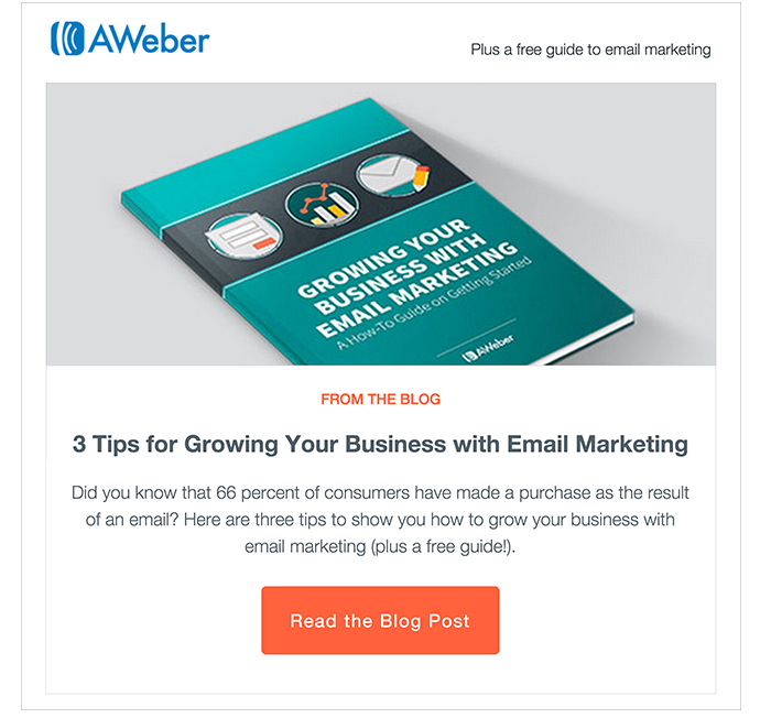
Image Credit: http://blog.aweber.com
Creating a great email design is not rocket science. All you need to keep in mind are some basic principles that cater to both written and visual content. As you’re going through these email design principles below, consider that your brand identity is tightly related to the way you present your marketing materials.
As such, each email that you send can be considered as one that represents your brand. This idea can help you make the right choice when making email design decisions.
Make Your Email Designs Mobile-Friendly
Mobile phone friendly email usually takes up the entire width of a user's smartphone or tablet. This is opposed to emails where the user has to zoom in on his/her mobile device in order to be able to read the contents of the email.
If you're just starting with email campaigns and are using one of the top email service providers, there are usually great templates with modern designs available. These adjust automatically when viewed on a phone as opposed to a desktop. Some examples of these designs can be found on email service providers such as MailChimp and ActiveCampaign.
Generally speaking, if you want your emails to entice people to take action (whatever that might be), you need to make it quick and easy for them to do so. If it takes them too long to understand what you’re asking (or is somehow too difficult to get done), they'll likely move on to the next email in their inbox. Ultimately, this means that your email will be lost in an endless mailbox full of other forgotten emails.
Moreover, ensuring that you have a call to action button or link at the top of your email (i.e. above the fold where users don’t need to scroll down), might sometimes be the difference between getting a click on your link or ending up with an email that gets ignored.
Go Hard On Personalization
Personalization can be used in many different ways, depending on your needs. One of the best things about using personalization is that you can make your email design more specific to the recipient by sending emails that use a mix of first names, locations, demographics, and any other type of data that you have about the people on your list.
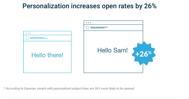
Image Credit: http://campaignmonitor.com
We all know that everyone’s favorite subject is themselves, and making use of personalization helps get more engagement from your target audience.
All of this means that marketing automation platforms allow you to design custom experiences for each user. Most tools also include the option for companies to create subject lines based on what a person has opened or clicked on before (which is essential if you plan on sending multiple consecutive emails to the same person).
Automation and workflows are also great for ensuring your campaigns deliver the right dynamic content, to the right people at just the right time - without needing much input from your side.Factor In Dark Mode
A basic tenet that should be considered early on when designing your emails is that some people will be using a "dark mode" or black theme on their phone or desktop. This is especially important to keep in mind if you're going to be using images with lighter backgrounds.
Having contrast in your emails is an effective email marketing design technique used by some of the world's best brands. It helps make things more readable and easier on the eye, especially for people who spend a lot of time using their mobile devices or desktops.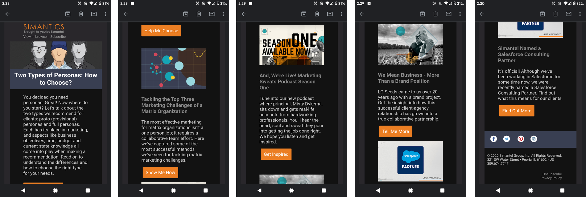
Image Credit: http://simantel.com
There are a few ways to include this in your designs. Some email clients understand what theme the user has chosen on their device and display the colors accordingly. However, you can also decide to have a "light mode" and a "dark mode" version of your emails.
The user would be able to switch between the two as they please. This might mean that you include a link to your email newsletter where people with dark mode enabled can read an alternative version of your email online.
Tidy And Organized Is Better Than Messy And Disorganized
When you're designing emails, I would advise you to keep things tidy and organized. This way, it's a lot easier for your users to find what they need without getting distracted by unnecessary elements or information.
The general rule is to have a clear distinction between regular text and headers so that everything is legible and easy to go through. You can even go as far as creating borders around each section just so there's no confusion about where things begin and end - though this might be a bit of an overkill.
Test, Test, Test And Combine That With Analytics
Finally, never underestimate the importance of testing in any digital marketing-related field. Email marketing strategies need constant refinements to get the most out of them and one must have the mindset that there’s always room to improve.
Every individual reacts differently to specific elements within an email design template and it is only through testing that you can understand what really works and adjust as needed.
Companies often do A/B testing where they send two versions of an email campaign with only one element differentiating them from each other. This particular aspect is then changed incrementally to figure out how it impacts the way people engage with email content.
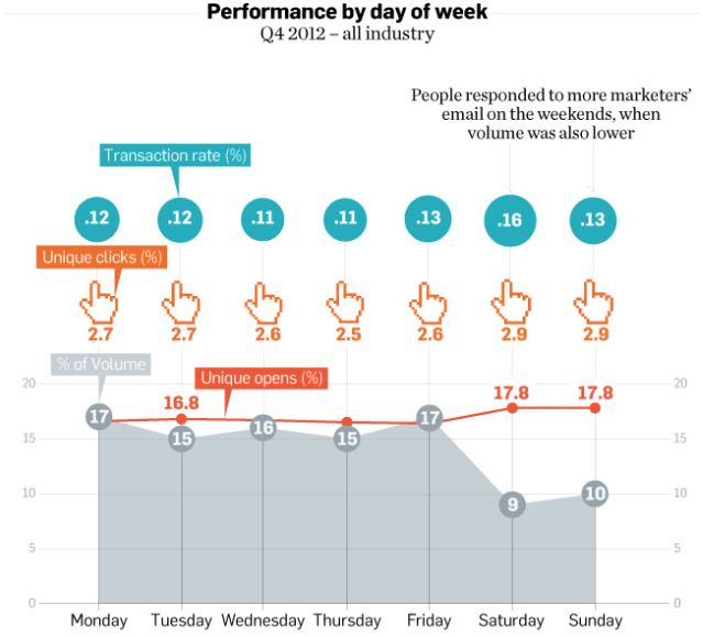
Image Credit: http://ignitevisibility.com
Specific email marketing metrics are also measured to make a decision about which version works best. These metrics can include everything from clickthrough rates, open rates, and unsubscribes via email.
Analytics is a must-have element to consider when designing email marketing campaigns. It gives you real-time information about what's working and what isn't, making it easy to troubleshoot problems in current and future campaigns.
How To Design An Email Marketing Campaign
Let's now go over the steps involved in creating a successful email marketing design.
Consideration 1: Think About The Layout
Email marketing software makes creating an email from scratch easier than ever. A lot of hard work has already been done for you by giving you high-quality layout designs that you can play around with to fit your needs. These layouts are typically mobile-friendly, ensuring that your email subscribers can quickly view them regardless of what device they're on.
The layout is an integral part of email marketing design because it's the first thing people see after they open an email. Therefore, you need to make sure that your design is straightforward and makes sense.
Consideration 2: Keep It Legible
Make sure each section is clearly defined and easy to read. Most people will be viewing mobile versions of emails, so keeping things legible on this smaller screen is crucial. If you're designing an email template, remember that there should be plenty of contrast between different elements so that they don't blend into each other.
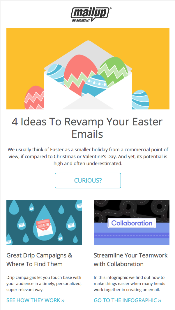
Image Credit: http://blog.mailup.com
This way, everything becomes more readable and easier to comprehend at a glance without needing too much effort from users who are just skimming through the content quickly.
Different sections can also have different types of divisions. For example, you might use a thick border to differentiate between the title and body in one section, while using a smaller line to show where one element ends and another begins in a different section.
Consideration 3: The Colours You’re Going With
A lot of email marketing design now uses a single color throughout the entire campaign. This is primarily to create continuity between all elements within an email template so that nothing looks out of place.
You can also decide to easily match different colors together through the software that you’re using. If you're designing your templates, it's best to stick with one hue rather than go overboard with too many contrasting colors. For example, don't put red text on top of yellow backgrounds - something like green would be more suitable because they contrast but are still easy on the eyes. If you use multiple hues, try sticking with either blue or orange, as these are complementary colors that look great together.
Consideration 4: Consider The Spacing
Having a lot of white space isn't recommended because it can make an email look unprofessional and difficult to read. However, not using enough white space isn't advisable either because it can lead to overcrowding and text that's difficult for the eye to follow.
There's no definite answer here to what works best - play around with spacing until you're happy with the overall effect.
Consideration 5: Should You Be Using Emojis?
Emojis are great for making an email design more engaging because they break up text and might be great to get specific points across. You can add emotion into text through emojis to express something in as few words as possible; something that might require a significant amount of words if it were to be expressed through text.
In addition, emojis fit in well on specific occasions. Some holiday email marketing campaigns lead themselves very well to emojis since they can be used to show a variety of emotions, such as being excited about upcoming events.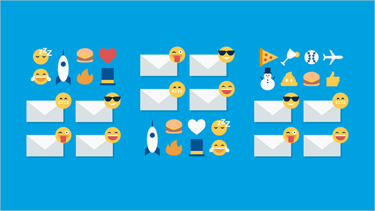
Image Credit: http://salesforce.com
With that said, if you’re unsure whether an emoji represents the exact emotion you’re trying to convey (in another country, the same emojis might mean something differently), it's best not to use it. The wrong emoji can cause more harm than good so when in doubt, it’s best to err on the side of safety and simply use the right words to explain what you mean.
Consideration 6: Fonts - Adding Focus To What’s Important
Using fonts that are clear and easy to read ensures that communication with your readers comes across clearly.
Fonts are also great for adding emphasis to some aspects of your email design theme so that important information stands out from the rest. For example, if you have a link in the footer of an email, using a different font will make it stand out more - the same can be said if the text is bolded, underlined, or italicized.
On top of this, it's worth mentioning that you should especially avoid the font called Comic Sans because it makes an email look childish and unprofessional at the same time.Consideration 7: Images - A Picture Is Worth A Thousand Words
Avoid using big images that cover a lot of background space because they can easily distract readers from vital information in your email. They also clutter up an entire design and take a long time for web browsers to load, which can annoy people with slow internet connections.
The best approach is to be very selective when using images in your email design. As with emojis, images should also be used very carefully when conveying a message because the wrong image can quickly be misinterpreted.
If you decide to use images in your email, it's best to choose just one or two that are highly relevant to the topic of your email to avoid confusing your email subscribers.
Email Marketing Design - FAQ
No. Operating systems do not affect the email marketing design. People that use Windows-based or Mac-based operating systems have no issue at all when reading the same emails. In addition, using templates created by your email marketing software will ensure compatibility and the correct display of emails.
The contact information you ask for will vary from business to business and the type of campaign you are running. I would always recommend asking for a name and email address to start with, and then, depending on your situation, you can ask for further information.
This can include the reader’s company name and industry sector. Keep in mind that the more information you ask for, the tougher it will be to convince people to share such information - especially when dealing with cold traffic that doesn’t know you.
Email best practices are the best way to ensure you end up in your subscribers' inboxes. Keeping to a strict standard when sending out your emails ensures that deliverability is as high as possible.
For further information, please check out our article on email marketing effectiveness.Yes, knowing some basic web design and branding is very helpful in preparing your marketing email designs. Preparing a template for your emails in advance will give you ideas on layout content and what format to use when creating the material for your emails.
This depends on many factors and is also dependent on the offer you are presenting to your subscriber list. When designing an email and setting up a call to action, think about what you want your reader to do when receiving your email - and then, work backward to create the content of your email.
The best calls to action are those that are tested and adjusted based on the actions you want your readers to take and the type of campaign you’re running.
Yes, it does. Using the subject line to tell the email subscriber what to expect in the email and even personalizing it using the reader's first name, will increase the chances of your email being opened. Using language and writing styles that are familiar to the recipients will also increase open rates.
Conclusion
In conclusion, email marketing design is a significant subject to consider. It is the first (and sometimes only) chance you get to leave an impression on your leads and customers. A good email marketing design will make you stand out from others, while a bad one will push customers away.
Work on choosing the best email template from the ones available (or even create one from scratch) before sending out any emails. This ensures that everything fits together and produces a solid, consistent business brand image that people will love.
By considering the above tips and tricks and applying them to your email marketing designs, you will be able to create the best designed and most effective emails possible.


0 comments